

A Pantone mismatch DTF Virginia order happens when on-screen RGB graphics or spot-color standards clash with physical CMYK direct-to-film pigments and curing temperatures. Fix it by inspecting the print under calibrated D65 lighting, calculating the Delta E shift against a physical swatch book, and submitting raw vector artwork with custom RIP adjustments through DTF Nova.
Getting exact brand colors on custom apparel takes deliberate management at every stage. Screen printers have spent decades mixing physical buckets of plastisol to hit precise spot tones. DTF printing compresses that same challenge into four process ink channels — cyan, magenta, yellow, and black — that have to recreate thousands of solid spot formulas on demand. That translation catches even experienced brand designers off guard across Richmond, Virginia Beach, and Northern Virginia.
When your customer needs an exact corporate hue across five hundred company shirts, close enough isn't an option. You need a systematic diagnostic procedure: spot discrepancies early, communicate variances clearly, and apply corrections before full production runs.
Understanding Why Pantone Mismatches Occur in DTF Transfers
DTF printers build full-color graphics through micro-droplets of process inks laid over clear film, backed by an opaque white underbase. Process printing runs on subtractive color physics; monitors run on additive RGB light. Those are fundamentally different systems. As the Pantone Matching System overview explains, proprietary spot inks rely on pre-mixed formulations, and many of them fall cleanly outside what standard CMYK process inks can reproduce.
Four specific factors drive most Mismatches:
- Gamut clipping: High-saturation oranges, electric greens, and reflex blues exceed the outer edge of CMYK color space. The RIP software has to compress those out-of-gamut shades to the nearest printable alternative — and that nearest alternative is sometimes noticeably different.
- White ink density: DTF transfers depend on a dense white underbase. Too heavy, and pastel tones wash out. Too thin, and dark garment dyes dull the top ink layer.
- Heat press shifts: Curing adhesive powder and pressing film onto cotton or polyester introduces thermal variables. High heat can shift colors, especially on moisture-heavy textiles.
- Profile misalignments: Designing in an uncalibrated RGB space and exporting without an embedded profile hands color translation entirely to whatever the RIP assumes by default.
Screen simulations never equal cured ink output on real fabric. Bridging that gap requires formal protocols, not guesswork.
How Do You Resolve a Pantone Mismatch DTF Virginia Order?
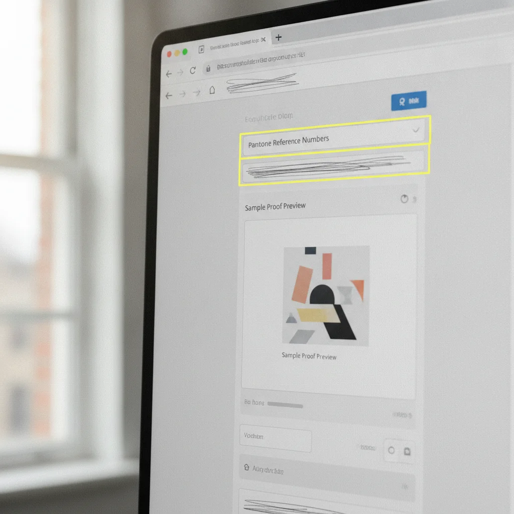
Resolve a color variance by isolating the physical shift from digital file errors through standardized colorimetry — before you ever order reprints. The four-Step framework below takes you from problem identification straight to clean production delivery.
Step 1: Document the Color Variance Under Controlled Conditions
Don't judge a suspected print defect under warm office fluorescents, a car dashboard, or direct sunlight. Standard fluorescent bulbs throw a heavy yellow cast that disguises blue-to-green transitions entirely.
Place the pressed shirt or raw transfer next to a physical Pantone Solid Coated swatch book under calibrated 5000K or 6500K daylight lighting. Photograph it with a neutral gray card in the frame. If you have a handheld spectrophotometer, measure the print directly and record the Delta E difference against your target PMS code.
Step 2: Submit Production Artwork and Source Files to DTF Nova
The moment you spot an issue, stop pressing the batch. Pull your original layered vector file — AI, EPS, or layered PDF — not a flattened 72 DPI PNG exported from web assets.
Include the exact target Pantone PMS number in your file notes. Our technicians can review the RIP spot-mapping tables to determine whether the software correctly translated your vector swatch into its closest CMYK formula or fell back on a generic RGB approximation. Before opening a support ticket, check our DTF Nova FAQ on color tolerance and reprints to make sure your ticket arrives with every required specification.
Step 3: Evaluate DTF Transfer Color Tolerance Levels
Industrial textile printing operates within defined numeric tolerances, not subjective impressions. Modern digital equipment aims for minimal variance, but textile surfaces scatter light differently than coated paper cards — that's just physics.
Review the Delta E calculation. Delta E measures the distance between two colors in CIE L*a*b* color space. A Delta E of 1.0 is the smallest difference the human eye can perceive under strict test conditions. In contract garment decorating, a Delta E between 1.5 and 3.0 is standard commercial tolerance. Above 4.0, corrective RIP intervention is necessary.
Step 4: Select the Right Color-Adjustment or Reprint Strategy
Once we've diagnosed the root cause, two paths forward exist: a calibrated color curve reprint or a physical color test grid.
If the mismatch stems from an out-of-gamut shade, running the same file produces the same result. Instead, our team generates a targeted Pantone color grid across your gang sheet space — typically 15 to 25 slight tint and shade variations surrounding your target PMS value. Press that small swatch section, pick the precise visual match on your actual production garment, and move forward with confidence.
This sequence takes emotion out of color disputes. Systematic measurement protects your profit margins by pinpointing technical errors before they become full-run problems.
Our Stance: Physical Swatch Grids Beat Digital Soft Proofs
Plenty of digital shops tell apparel brands to trust PDF soft-proofing tools. We don't. Soft proofs on uncalibrated consumer screens are unreliable for high-stakes color validation.
A backlit LCD generates luminous glow that ink on combed ringspun cotton will never replicate. Cotton absorbs light. Synthetic polyester reflects it. Displays blast light directly at your eyes. Those are three entirely different optical situations. Spending five minutes pressing a 4x4-inch test swatch onto an actual production blank prevents hundreds of dollars in wasted apparel and blown deadlines.
The Print Management Institute guidelines on color management are clear: physical proofs remain the reference benchmark for spot matching. Whenever you onboard a new corporate client with strict brand guidelines, dedicate a small corner of your gang sheet to a localized color grid. That five-dollar Step gives you proof before you run fifty shirts.
Color Tolerance Ranges and Action Steps
Deciding whether a color mismatch demands an immediate press stop or clears standard apparel inspection comes down to objective numbers. Use this breakdown on your next print run:
| Delta E Variance | Visual Perception | Production Status | Recommended Action |
|---|---|---|---|
| 0.0 – 1.0 | Imperceptible to naked eye | Perfect Match | Proceed with full batch pressing. |
| 1.1 – 2.0 | Noticeable only on close side-by-side study | Commercial Grade Match | Standard for all retail and event apparel. |
| 2.1 – 3.5 | Slight tint or saturation variance visible | Marginal Tolerance | Acceptable for general merchandise; review brand specs. |
| 3.6 + | Obvious mismatch across room lighting | Out of Spec | Halt production; submit files for RIP color re-mapping. |
These thresholds take the subjectivity out of Resolving a Pantone mismatch DTF Virginia dispute with a print partner. Clear numeric standards settle color arguments faster than any back-and-forth over subjective impressions ever will.
What Causes DTF Nova Color Issues on Garments?
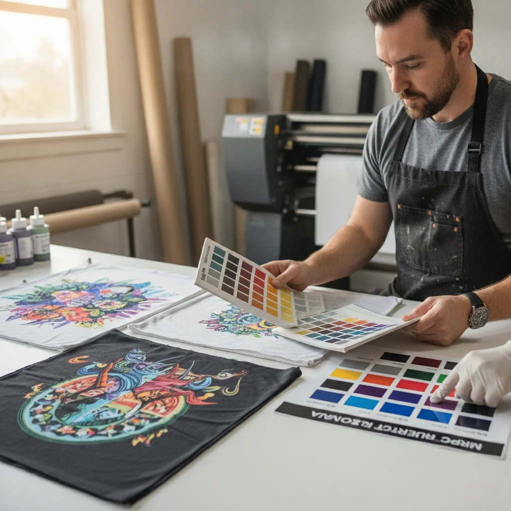
Color variations after pressing usually trace back to fabric chemistry, heat dwell time, or adhesive interaction — not raw ink application. Even when ink lays down accurately on film, poor application practices disrupt final pigment clarity.
Three mechanical and thermal culprits come up most often:
- Heat press hot spots: Uneven heating elements across manual clamshell presses yield inconsistent transfers, creating blotchy color across large chest designs.
- Dye sublimation migration: 100% polyester garments release dispersed dyes when heated above 300°F. Those dyes bleed upward into the white ink layer, muddying bright pastels into murky tones.
- Inadequate pressure: Low pressure stops adhesive powder from embedding flush into fabric fibers, so light scatters unevenly off the print surface and the color reads differently than intended.
Calibrating your heat press with digital surface probes protects color vibrancy across every production shift.
Best Practices for Preparing Gang Sheets with Exact Colors
Clean files yield predictable results. When building gang sheets for brand clients across Virginia, prep files this way:
- Design in vector format: Keep logos, typography, and solid shapes as vector assets so the RIP engine reads spot color metadata directly from the file.
- Use Pantone Solid Coated references: Always assign PMS Solid Coated codes rather than Uncoated or Pastels — digital RIP profiles map specifically to Solid Coated libraries.
- Don't export merged raster files: Flattened JPEGs strip color separation layers. Export transparent PDFs (PDF/X-4) or 300 DPI transparent TIFFs that preserve embedded ICC profiles.
- Check your black values: Avoid 100% pure K black on large solid backdrops. A rich black mix — 60C, 40M, 40Y, 100K — delivers deep saturation without pinholes.
Pair disciplined digital prepress with our precision DTF UV and apparel film production lines, and your shop produces predictable results on every order.
Frequently Asked Questions
Why does my printed DTF transfer look different from my screen?
Computer screens display designs in RGB light, while direct-to-film printers build graphics using CMYK ink with a white underbase. Digital screens also emit backlit light, creating a perceived brightness that physical pigments pressed onto fabric cannot naturally reproduce without specific color profile adjustments.
What is the acceptable Delta E tolerance for DTF transfers?
A Delta E between 1.0 and 2.0 represents an industry-standard commercial match that the human eye rarely differentiates at normal viewing distance. A variance under 3.0 is generally acceptable for mass apparel production, whereas brand-critical corporate logos typically require a Delta E below 1.5.
Should I design in RGB or CMYK for DTF transfers?
You should design in sRGB or direct CMYK depending on your artwork pipeline, but always verify your spot colors against a physical Pantone Solid Coated swatch book before rasterizing. DTF Nova RIP software converts files through custom color profiles built specifically to map spot values accurately to physical ink output.
How does garment color affect my DTF transfer hues?
The solid white ink underbase in DTF printing blocks shirt dyes from showing through, but synthetic fabrics can cause dye migration when cured at excessive temperatures. Pressing transfers onto dark poly blends without correct heat regulation can subtly tint light ink layers, altering target Pantone tones.
Ready to Perfect Your Brand Colors?
Don't let color shifts ruin your customer deliveries. Partner with a dedicated print team that understands spot color translation, custom gang sheet building, and high-durability apparel transfers.